Thursday, 30 October 2014

Tinchy Stryder & The Chuckle Brothers - To Me, To You (Bruv)

There back! the Chuckle Brothers are back on the map. I use to love there shows when I was younger and I even saw them live at the Big Bash at the NEC back in the 90's. This latest track from "Tinchy Stryder" must be such a trip down memory lane for so many people my age and that's why it's popularity will grow and grow until it's had it's day.

Although the track is a little naff, it's a clever idea which will do all three of their careers a real boost. This video has over 1.3 million views within a week and recently been in the Radio 1 live lounge which will surely push it up the charts to number one for it's comedy value alone.

Overall it's a great bit of fun that reminds me that I'm getting old but above all else, the Chuckle Bruv's are back on the map1


Here is another example of this type song which is very popular known as "Buttery Biscuit Base"


Wednesday, 29 October 2014

Games "Special Edition Box Sets"

For this part of my research, I am focusing on game special edition packaging designs and the unique products that come with them.

Bio Shock Infinite By Irrational Games
I love this game, it's both imaginative and a joy to explore it's floating city setting. The package design is a well rounded package that's an extension to the deep storyline. The packages colours are bright and loud just like the game world and the art work has a distinct vintage vibe which yet again is a nod towards it's 1912 time period. I like the idea of all the little products that come with it such as the key ring, statue and concept art. I fuels me with ideas and the scope of what a special edition game package could behold.

The Elder Scrolls
This game is one that I haven't played because I don't have the time to explore this vast world. I can tell that it's a game inspired by fantasy, one where elves and dwarfs inhabit. 

Looking at the box set, it has an ancient look to it, the map has a weathered brown stain look to it which shows the player the vastness of the game which you are about to explore. Yet again the box set comes with an art book with cool character art and concepts. All this is wrapped up in a box which has an old bonded book look to it which reminds me of an old copy of Lord of the Rings. 

I like how they have used old texture effects on the box. It's like the creators are setting you up for an adventure which is true.

Uncharted 3 Drakes Deception Developed by Naughty dog
One of personal favourites of past years is this amazing game by "Naughty dog" Its a game of adventure that's story driven like a Hollywood Blockbuster full of amazing set pieces that get the adrenaline going.

The box set a contains a steel book case which houses the game disc, a figure and wearable objects and more interestingly a box labelled "travellers chest'. I have to admit that some of the content are aimed more at a younger generation or massive fan because i just can' see my self wearing objects from the game although they are nice collectibles. I'm more interested in the box that implies travel, I like how it has an old patina an how they have decorated it in what looks like Asian inspired patterns to it, which is where the story leads you to. 

It's these little details that what make up a cool looking package. If i was to go down this route the games story, setting and characters would inform the overall design.


Rome II
This is another game that doesn't interest me but the special editions content certainly does. I know it's a game of strategy and as an extension to that theme, It looks like they have includes actual board game with strategy in mind. What I'm more interested in is the small catapult. It shows me how imaginative I could take a product like this.


Alan Wake by Remedy
I liked this supernatural thriller, it was a game about  a writer who is living in one of his own super natural novels as he writes it. I love the packaging art work. It has a simple yet effective typography style to it which leads me to believe that this idea of creating a game special edition is an actual possibility. I like how they have made a quirky book (novel) box design which has drawn inspiration from the games story.
Grand Theft Auto V by Rockstar Games
Last but not least, a game from "the king of games" in my opinion, a game so ambitious in scale and story that sold a record number of copies ever. I'm taking about Grand Theft Auto V. The games spacial edition is an extension to their brilliance of design. The whole game is centred around money and heists and they have took that theme and injected it into their package. The whole look of the images background has been themed around the dollar bill which is a nice touch. The blueprint map is a clever idea to show the map of the world which yet again is a nod towards the heist an money theme. They have included loads of additional content in the game which is exclusive to this package. There is also loads of extras such as a t-shirt and hat amongst other small details.

I'm really excited by the idea of creating my own unique special edition box set but it's one hell of a task to do justice. looking at the criteria, I know that this would be the perfect product to cover it. There is the cultural aspect as to the many gaming cultures out there plus, the many types of cultures that may inspire the games story line. The story line and artwork that would come with it would cover the idea of being able understand and apply visual language into a narrative and all of this would inform the overall design. There's room for experiments, drawings, concepts, material's and much more.

 Above all this, it's a test into the unknown and one that I would learn vast amounts from to will test all my skills that I have learnt over the years into one neat package!


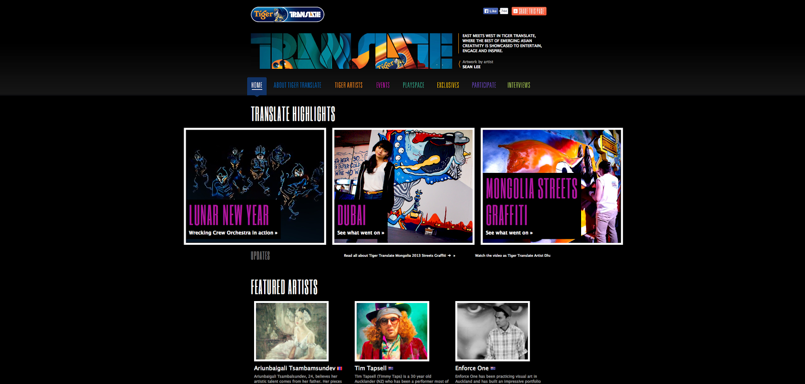
Tiger TRANSLADE


I'm so glad I found this website, it's a perfect example of the type of event that I'm trying to create, A place where a variety of different cultures come together but with one difference, mine is an event as opposed to a website.

But I have discovered that Translade helps and organises events which are a celebration of different cultures through the arts which has got to be useful for idea's design and styles inspiration and techniques.
I love the way the website has been designed, It gives me insight of ways of how I could present my work via a presentation.
This is going to be a great source for artist's for this project  as well as future one. The website states that it's a showcase for the best Asian creativity has to offer.
I love this piece by an Artist from the Philippines known as "Bjotnik" The illustration  is a colourful pieces which really gives me the urge to have ago. The idea and style would fit perfectly into my event but I have to admit I know how long this could take because I have created a illustration similar to this in the past and believe me when I say " they take ages" but I still like the idea of an illustrative map in a much simpler, cleaner looking design. May be I could incorporate a 2D design style like Eiko's work into an event map?
This image was used a s a main identity for a street party that was held in Dubai. The event was a place for over a 1000 party goers to culminate in one place to celebrate everything from music and dance, through to art workshops.
All images and Information and one cool website can be found at


Experience the boundless possibilities of creativity and discover work that entertains, engages and inspires you.

Liu Zheng aka 96k

The Tiger Project Gold

After looking through a list of Asian born artists and designers, I came a cross a selection of pieces from an artist known as 96k. The work was designed for the product "Tiger beer"in conjunction with tiger Translade which is an interesting website where artists from all walks of life contribute artwork, plan events amongst other things which I will look at later.

The artwork has most certainly been created using vectors in illustrator and there is a definite Asian theme going on within the pieces because of the fact that it's been created for an Asian (Indian) beer.
The first thing that struck my attention is the colour pallet, the first two out of the row below have colours which are related to the "Tiger Beer" logo. I like how he has used it sparingly to create contrast and how the image is balanced mainly through symmetry.

It looks like the artist has been influenced by a variety of Asian cultures, which would make sense because the Translade website states:

"Tiger Translate aims to celebrate global creativity through the exposure to different cultures and experiences. Bringing creative Artists from the East and West together, we showcase their artistic collaborations spanning the areas of music, design and art, fashion, dance, photography and more.

Overall I love the style and one that could work well within my event as an overall style. I could look into certain Asian patterns and artwork further do draw inspiration for experiments.

I like the way the artist has used a mix of colour with black and white  and the way he  has seemed to draw inspiration from a number of cultures to design these pieces.

The striped on this one reminds me of a tiger which is surely the idea? I love the symmetry within each piece,  I'm sure you see this a lot in Asian art, like Nepalese statues?
This one is my least favourite,  I just don't like the photoshop elements and the random content which probably has a meaning which I don't get.

Year: 2007 Client : TigerBeer & Idn Artist : 96k (Liu Zheng)

Sunday, 26 October 2014

Asian Cooking Utensils

Carrying on from my Asian cuisine research, I thought of taking a look at some of the many traditional tools used in Asian cooking for inspiration towards my project. They could be used as a base for logo designs or other means of design for my Asian event.
The Bamboo Steamer
Has been used for centuries for steaming all kinds of foods from vegetables, right through to fish. by steaming the ingredients, the food retains more of it's minerals and is a healthier way to cook.

A Traditional Chinese Wok
A symbol to Chinese cooking the woks design manages to give out an even heat throughout


A Indian Chapati Press
A Chapati Press is for flattening Indian flat breads to avoid burning their hands.

A Bamboo Skimmer
Is typically used for draining fat from dishes that are being fried.

An Indonesian Pestle & Mortar
Described as the backbone in an Indonesian kitchen because the main element of the cooking is spice paste which is ground down using the pestle and mortar which is typically made of stone.

A Traditional Wasabi Grater
A traditional grater is made out of wood for the base and handle and sharkskin for the face. As you would imagine these types are hard to come by. The skin acts as an abrasive to grind the wasabi down to a smooth paste.

A Traditional Tandoor Oven
A Tandoor oven is made out of clay and is used across South West Asia. A fire is lit at the bottom  to heat up the oven, then the flames are extinguished to leave hot coals. Its used cook meats and Naan breads and has an advantage of keeping hot long after the flames have gone, which is good for areas that have limited fuel.

The Humble Chop Stick
Used across many areas in Asia but first used by the Chinese. Over the years, the  Chinese used to use twigs to grab food out when they where cooked and over time the chop stick was born. when poor families had to ration out food they used chopsticks as a means to get the most out of a meal and be fair around the dinner table because a fork would enable you to grab larger, varied sized portions.
This was a great bit of visual research which has given me an idea for some visual experiments. I like the idea of using these utensils as a base for some graphic logos. Thinking out of the box I could use a cop stick as a way finder sign around the event, or a traditional looking wok design for a disposable plate! I'm going to print these off and start sketching out some ideas.

www.gourmetsleuth.com (information)
www.google.com (images)

Asian Cuisine


First and for most wow, I never new about the vast amount of types of Asian cuisines there are! It's really quite over whelming to try an narrow it down to just one type. After some research I have found an interesting piece of information that has helped me to narrow this vast list in to three categories which are three areas on the Asian continent namely the South West ( India, Pakistan, Sri Lanka, Burma etc), the North East (China, Korea, Japan etc) and the South East (Vietnam, Indonesia, Cambodia etc). 

I have found that all three share a staple starch which is rice but each area has other starches such as egg noodles and breads. There are other similarities like like curries but one may be made with a yogurt bas whilst another with coconut milk. Where I would imagine the differences lie are the type of ingredients that are native to that area and have be come part of that regions culture in their cuisine

 The North East 


The South West


The South East


Believe me when I say "I could be researching this topic forever" because there is so many areas to cover but I must add that my project is heading towards an event of Asian Cuisine, a fusion of foods from businesses and the general public gathered together in one place celebrating and promoting their recipes and products. 


It's still important thought to be looking at this information and images because it should and will inform the design of the event and not just the food the colours, the art and the whole culture.

Images and information sourced from www.asian-recipe.com

Asian Architecture


After researching in to Eiko Ojala's work I felt inclined to draw from his style and try to apply this using Asian architecture as base to draw from. So I sourced four images that have a distinct different style from one and other.
All images sourced from Google Images
Japanese Architecture
Each style of buildings has a distinctive look, may be I could include some nature that is linked with the country e.g. Japanese blossom.
Indonesian Architecture
What an amazing looking building I never knew how varied different culture architecture are. This looks like something from a fairy tale.
Chinese Architecture
Although this is a modern building, it still has a distinct look to it that retains aspects from the countries history.
Indian Architecture
Because I will be focusing on the shape (like a silhouette) rather than the detailed textures, colour could play an important role. A strong red for japans architecture would be fitting because of that link to "the land of the rising sun" or a purple for with gold leaf edges for the Indian imagery?

Tuesday, 21 October 2014

Eiko Ojala

The following pieces of work are from a illustrator and graphics designer know as "Eiko Ojala. He works using digital software but starts these amazing pieces of art by hand. I struggled to find his exact process but I would imagine that he would carefully draw the illustration out before taking into illustrator or more likely photoshop to render it up. He explains how light and shadow play an important role in his work which is clear from observation. He manages to give objects that appear flat like pieces of cut out paper and injects depth into his images with light and shadow. 

I just love this style, It's the simplicity of the look of his that I like the most (Although I know that a lot of work has gone into these two pieces. It's a style which that I think would suit an Asian theme as well, imagine some Japanese architecture crafted out in this style or a Vietnamese fisherman cut out in with a shade of green applied to it? I could also draw inspiration from the well known art of origami. And thinking along the lines of a presentation video or advert, it could well be achievable to create an film something like this for real!

For more work from Eiko Ojala  vista his website at 
"New york"
I like his use of colour and how he as effectively
 made the small people stand out.
The detail is outstanding, Judging from experience I would
say he has used a combination of illustrator and photoshop because those cast shadows look hand rendered. 

This piece was created for the paper "The Sunday Times"
Its called "72 Hours Cities"
This reminded me of how I dismissed the theme of
"travel" in my sketch book and has opened my eyes
to think out the box a little.


Overall, I feel excited to take these Ideas and put them into practise, I might try and create some Asian architecture and see what comes from it. I also like the idea of creating a video using the same method but I have to bear in mind the time issue.

Sunday, 19 October 2014

Sainsbury's by Twelve Design


Here is another example of a large design project from "Twelve Design Studio" for the well known supermarket "Sainsbury's". They themed the overall design using local landmarks from the golden mile such as the the iconic Blackpool tower and the south pier. I like how they have used Sainsbury's corporate colours within the illustrations along the walls.

This is another example of how grand my ideas can go and because this is just merely a idea on paper as opposed to the real thing but, it's the way I present this these ideas which will give me that professional edge.
I like how they have drawn inspiration from the local landmarks.
It's good how they have have included Sainsbury's corporate colours into the design

Three Potential Interview Contacts

The Cafeteria


The Cafeteria is a small design agency with a work ethic that hinges on good communication. They make sure that they collaborate with the client to express their ideas and make them become a reality.

Their work consists of a range of different approaches to design such as branding, identities, printed communication of all kinds and even exhibitions. In my opinion, I would say that simplicity is their main style, they get straight to the point without over complicating things which is what visual communication is about.

They would be helpful in my development because they are small team of designers who are clearly passionate about what they do because the success of the business is in the hands of a few. I believe I could learn a lot from a discussion with The Cafeteria, on both their approach for each project (e.g. research, collaborations) and their practice (e.g. what software they use, printing process, etc) so I could channel that information in to my own practice.

Phone: 0114 255 8213

Ink & Water


Watch this video here

Ink and Water is another design agency situated in Sheffield who has wide range of skills on offer. 
The company comes across as a real down to earth place made up of proud local people who are passionate about what they create which comes through in their work. Their skills stretch from illustration, graphics and photography to as for as film making. 

I would just be happy to make contact with this place for a start. I feel like it's a place where I could really grow as a designer, a hub of creativity where I could learn so much more about design practices that I currently do. A few worlds of wisdom would be a fantastic start which could lead to a handy contact in the near future.

Phone: 0114 272 0005
Email: hello@inandwater.co.uk

Greg Staples


www.gregstaples.co.uk
Greg Staples is a freelance artist who has made it big. In his early years, he started working for companies such 2000Ad comics drawing iconic characters such as Judge Dread. He now works as a concept artist and as has an impressive list of clients who he's worked with in the past on films, games and books. He has painted visions for big films such as Dooms day and even designed the costume for Brad Pitt for his recent role in World War Z. 

I have already tried to make contact with Greg some time ago but he failed to respond, but a few years have passed now and I have grown more confident in my self to follow it up once more. I believe he could teach me how to become successful and how to get my name out there as a designer. He also lives just down the road from me which could be convenient for him, which could help when making contact.