Thursday, 6 February 2014

Trial And Error

I felt that the I needed to do further experimentations before rushing to get it finished, So I started again.
This time I used a setting known as HDR toning to try and enhance the images that I had taken.

But I felt that the effect didn't work for what I had in mind, it made them look too bright and I found it hard to try to get the right effect, I felt less in control of the image.

But I kept on going to see if I could make it work, So I started to cut out some foliage to see if it would help make the image better, for this I used the channel masking technique and painted out any excess pixels

I placed the object in the image but yet I felt the image wasn't feeling natural so I left it there. 

Then I started to play around with other objects I had cut out to give myself a idea of how the composition would look . The hands do look ok but there is work to be done to make them feel as if they belong in the image as opposed to looking cut and paste, burning some shadows and dodging some highlights will help me with this.

Then I had ago with a custom brush named storm cloud and painted in some cloud effects. With some care and attention this could work.

Now I am starting to build this image towards a final out come. I started as I did before pasting photos, altering there perspective and blending them using layer masks.


I yet again used channel masks to cut out complex parts of the image 

Blended them in within the screen


Until I ended up with this. I am happy with this start, It looks natural the rivers flow the right way but and the perspective looks right in my opinion. I thought of placing more elements within the screen but I thought there was enough within the screen.

Now I tried out a technique so I could control the light in the image.(this is something that would be done in the final stages as you have to flatten the image to achieve this effect). I flattened the image duplicated it, lowered the brightness on one layer and brightened it on the other, then I applied a layer mask which then gave me the freedom to pain light as I pleased. This will really help give the image some atmosphere. 

Now I started to think out of the box or out of the screen if  you will.

I started to place other images to see what fitted in with the image It was case of trail and error, flipping images horizontally,  


Blending them In

Using the pen tool for more refined selections 


Until I ended up with this, This is as far as I have saved up to, in other words I am happy with this. now I want to play around with the composition and effects to get a idea of how I can take this further

This just seemed (the fountain) too out of place.

Same with this it didn't seem natural and was hard to try and blend in.

Now this is better I like how this part of the fountain fits, I can see how I can redirect the flow of the river and have a natural cut off point of the image

This Image gives me the idea of where to go next and gives me confidence that this image will look good and not a total disaster. With more refinement and care I could do this project justice.

Sunday, 2 February 2014

Neil Woodall

Works done by Neil Woodall
Aquatint Prints
Sheffield Millenium Gallery

The Forest 2013

Gorsey Bank 2013

Derwent-Upstream from Haddon 2013

Neil Woodall is the artist that I have chosen to base my report on. His work is a series of aquatint etchings of natural landscapes landscapes that are based on the peak district. The quality of the prints are amazing, the detail and skill that has gone into the print plates are on another level.They look photo realistic but with a rough blotched effect that gives them some style. I like the absence of colour and how he still maintains a high level of detail using different shades of gray. He also mangoes to achieve depth in his prints with slight changes of the tones. The process is a very long and time consuming one but once the print plates are done he is able to achieve many prints from one plate but the plate will eventually ware. Firstly he degreases the plate with ammonia so there are no traces, as this would contaminate the plate. he then paints ares that he wants to achieve a certain tone using a paint. Then he covers the other areas with a stop out varnish, from there he places the plate in a container (known as aquatint box)that circulates a dust that covers the plate and sticks to the exposed areas. From there he places it into a acid bath so it eats into the exposed area and creates a tone, the longer you leave the plate in the acid bath the darker the tone, then he removes the varnish using mentholated spirits, this is process of how he will build up image. To print with it he works a ink into the plate so it goes into all the groves of the image, then he wipes of the excess ink with a cloth until it is polished up and ready for print, he prints using a big printing press that pushes the inked plate onto paper to then reveal a print as shown above.

Building the final image

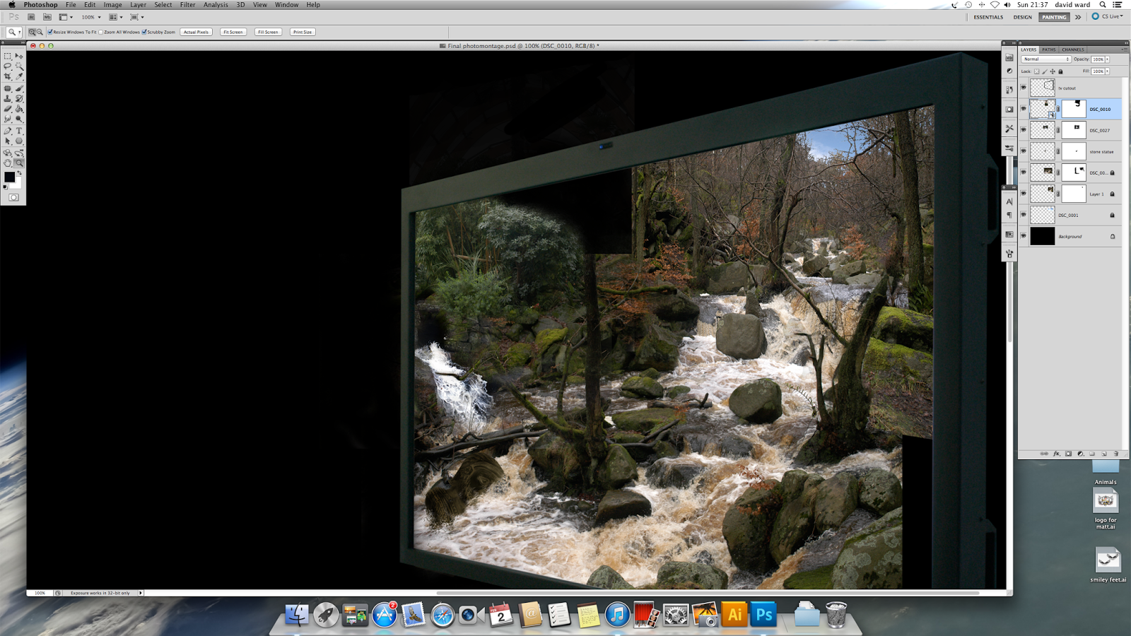
First I opened a A4 canvas in photoshop and filled it with black, then I cut out the television using the pen tool for a crisp cut until I just had the frame left and placed it in the corner.

Then I opened this photo on a separate canvas. I wanted a blue sky in the background so I had to remove the dull cloudy sky, but to do this with the pen tool would take too long. This is where channel masking came in handy. 

I went the channels menu and looked for the best contrasting layer, blue was the best so I copied it then went to level adjustments then began to change the layer until I had a complete silhouette effect. Now it is easy to make a selection of the sky with a layer mask and remove the sky, the river had disappeared but with a layer mask it was easy just to paint the river back into place.

Now I dragged the photo into my main canvas then changed the perspective (free transform) so I would fit with the angle of the television 

Then I just placed a picture of a blue sky behind that layer.

Next I started to build up the river and try to achieve some depth in the image. I placed photo another  above the previous and added another layer mask, then I blended the two together by slowly painting (using a graphics tablet) out parts of the image until I felt happy that they belonged together.

This was the result, notice how I have made the image in the foreground slightly bigger to give the impression of depth into the television 


I then tried to fit this image to to the left hand side of the river bank but It didn't fit in naturally so I removed It 

Next I added this little statue, I cut it out, placed it then i changed the brightness and contrast to make it look more natural, then I burnt some shadows along the left hand side to add more realism then rotated it and placed it in the river , then I added a layer mask and blended it into the river using a custom splash effect brush to give the impression of water flowing around it.

Then I added a small waterfall to the far left and blended it with a layer mask again
So far so good I am feeling confident but I do feel this could be better I will carry on to understand if the composition will work. I do fell it needs to be bigger and more refined, but at least it has given me the confidence that this idea will work.


Thursday, 30 January 2014

Oculus Rift


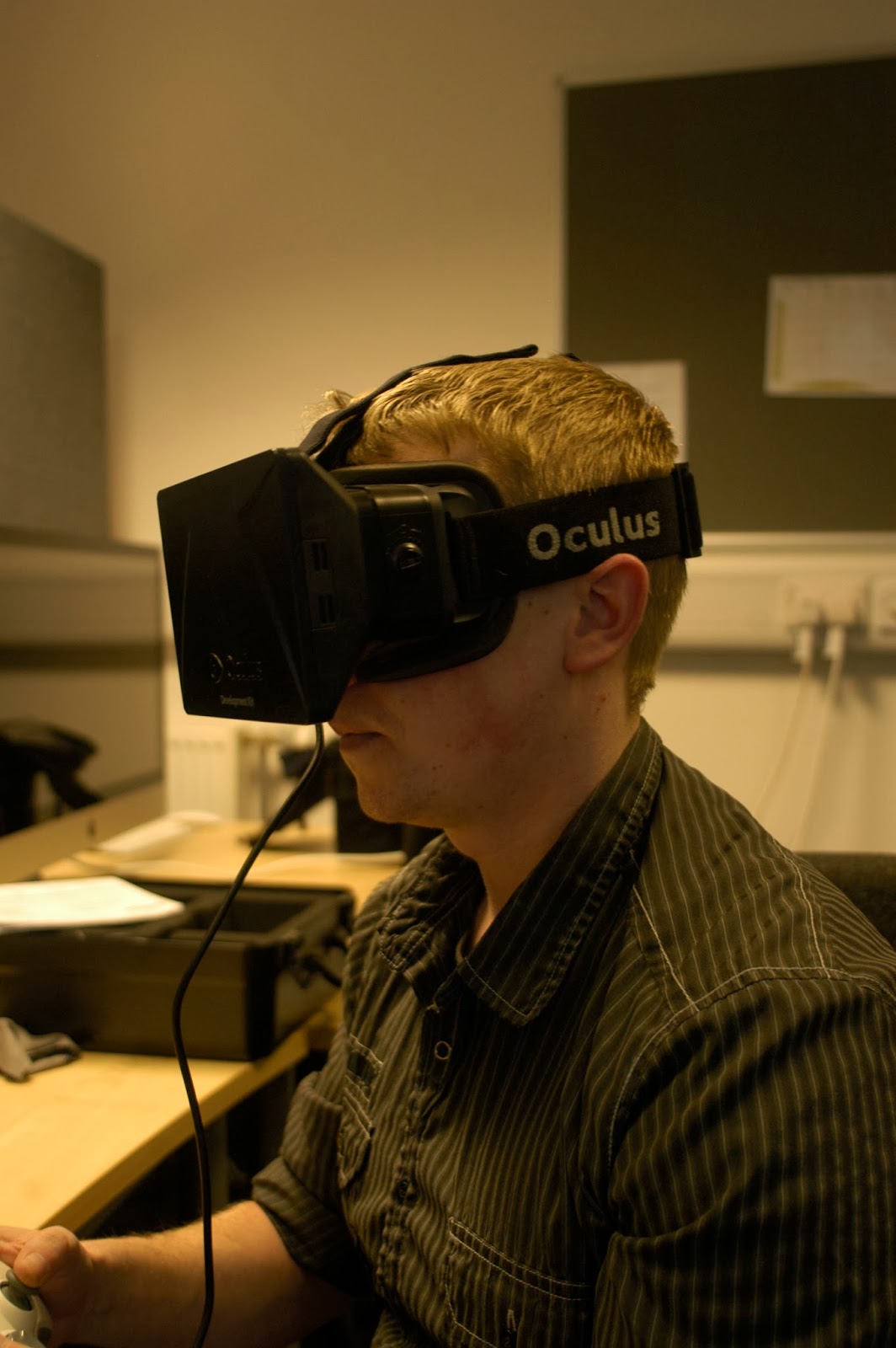
I cannot believe my luck, the opportunity to experience a demonstration of oculus rift. Especially that this whole project is about escapism. Oculus rift is virtual reality that works, and shows true potential as a way forward for games.You actually feel as if you are there. My first demo was of a countryside villa , I walked around took in my surroundings the frame rate was super fast and kept up whenever I turned my head, Then I stepped outside and caught a glimpse of a butterfly fluttering around the garden. The graphics are nothing to shout about but that didn't spoil the experience, and I know that this isn't the final version so there will be vast improvements. My second demo was of a shooting game in a cube made out of lasers, you had to fly around shooting cubes within this three dimensional space It gave me the feeling of flight, especially when I when for a loop the loop, I can understand why this could cause motion sickness (another area that I'm told that will be fixed) and finally I experienced a flying game that was controlled with wherever I looked. Overall I was very impressed with the technology, I can see so much potential for games,  It could place you in the middle of battle fields, scary horror games and globe trotting adventures the list could go on, and imagine the educational purpose's, virtual tours, school kids taking a history lesson in and amongst the first world war, and what about the benefits for the disabled, bed ridden and house bound. The only thing that has to improve is the graphics, and if game developers produce triple A titles for it then greatness awaits.
This could fit in to my project well but I have building up a idea already, it's a shame that I didn't experience this sooner, I am not ruling it out yet but time grows really short and I have to start finishing this project off. 

Custom Brushes

For this experiment I am looking at how to create my own custom brushes in photoshop, traditional and found  materials
First I gathered some leafs.

Then I scaned them In full colour at a high resolution to pick up the detail.

Then I opened them up in photoshop and desaturated the colour so that thew brush would work right. I  also adjusted the brightness and contrast to see what effects I could get. Then I defined the brush preset then hey presto, one custom brush.

From there I played with the settings, I used the setting known as scatering to give a scattering effect ,I changed the colour dynamics and altered its size. This opens up even more ways to use photoshop creativly , looking back I could of changed the perspective so it would fit with a certain image, I could change the opacity and build up paintings using this brush, there is just so many things you can do, but I havn't got the time to experiment with them all.
For this texture (custom brush) I used a mixture of salt and ink

For these two I went for a splattered ink effect for the image on the left and a mixture of sugar and ink for the image on the right for a more grainy look as opposed to the finer look of the salt and ink texture.

For these two (above and below I used the found leaf from earlier and aplied some acrylic paint to the surface and made a print.  


Then I used the same process (scan, desaturate, define brush preset.

And this is the final outcome textural brushes there to be used and manipulated if and when they are needed.
This as been a fun task, the final result has realy been effective , it has been nice to use mixed media in a digital form I know this method will come in handy in the future.