
Showing posts with label Digital Media. Show all posts
Showing posts with label Digital Media. Show all posts
Thursday, 27 February 2014
Final Word
What a project, I learnt so much these last ten or so weeks I'm so glad that I pushed myself to do new things because from now I feel that If I believe I shall acheive.

Digital Painting Process
 |
| First I split the character and chair and background into shapes on seperate layers one I had painted the shapes in a flat tone I locked the transparent pixels. |
 |
| This gave mje the freedom to paint without going over the edges. |
 |
| Then I started with the skin tone trying to distinguish the lights and darks of the tone. |
 |
| Then I started to block in the mid tones of the clothing |

 |
| The food and any other parts in a flat midtone colour |
 |
| Then I started to work into the face to try and define the features |
 |
| It was just a case of patience |
 |
| I used one of my experiment images to help me build up the face |
 |
| Then I started on the control pad and vest working into the canvas trying to describe the form with light and shade |
 |
| The pad proved to be really tricky |

 |
| Next I started on the chair layer and started to work into that layer |
 |
| For the fine details like the seam on the chair I used the pen tool to make some selections for aclean line |
 |
| Then I just kept on going |
 |
| Until I Finished This was really hard to create and I am pleased with the result , my confidence has grown as the image has grown and I feel like I have done quite well. |
Tuesday, 18 February 2014
Digital Painting (My Process)
 |
| My stage is to open the image and place it on the canvas, I put it at the top of the layers panel and set the blend mode to multiply, this allows me to see what I am painting and still see the line drawing. |
 |
| Next I am blocking in the image with basic flat colours to begin with |
 |
| Adding and changing until I feel It looks right. |
 |
| Until the whole image is blocked in, from here I will slowly refine the image by adding variations if the tones to try to describe the forms until I feel ready to switch off the line art and render it up to the finished painting At this stage the image doesn't fill me with confidence but there are no second chances here I just don't have the time so I will keep on going and see where it ends up. |
Monday, 17 February 2014
The Opposing View
 |
| The playstation advert was my way of showing the good side of escapism now for the dark side. This is the final line art that I am going to use for the base of my painting. I wanted to create a character of a gamer addicted to games, a gamer that is forever glued to the screen, but I wanted to inject some humour into the image so I created this gamer chair that never takes you away from the action. I want this room to be dark so I have focused on the details in the foreground as I want the room to blend into darkness, the window is there so I can hopefully have some natural light creeping into the darkness to give that impression that the character is isolated away from the real world but it's always there. This image is a gamble I feel It could go wither way it could turn out good or atonal disaster, so lets find out. |
Thursday, 13 February 2014
Colour Studies (Digital Painting)
 |
| This sketch is a rough idea of where this image is going . I have made notes of ideas that have come to mind as I sketch. I feel that the character needs to fill the frame more as he needs to be the main focus of the image. |
 |
| I have started to block in the basic shapes of the composition in flat colours using a soft brush without pen presure (graphics tablet) I have kept the background and characters on seperate layers so if anything goes wrong I don't ruin the whole image. |
 |
| I think that the colour choice looks too bright and cheery, I toned down the colours with a ajustment layer to alter the brightness of the colours, this is where keeping certain elements on differnt layers will become important so that I can have more control of the image. I want the image to have a blue tone as if the only light in this dimly lit room is coming from the tv screen, but this would comlicate the colur pallete as it is a area that is daunting to me so I wonder if a hue saturation layer would work ? |
 |
| This could work but I doesn't give me a full idea ofd if it will be sucessful effect but the point is that in photoshop this can be added and removed easly. |
Final Adjustments
 |
| Now I was working towards the final image I placed a photo cut out of my hands holding a control pad and painted in the light using the same technique for the screen and blended them witha layer mask into the background. |
 |
| Then I placed the image of the playstation three (that I cut out) and placed it in the corner, from there I duplicated, rotated and flipped it horizontaly then lowered the opacity to give the impression of a reflection. |
 |
| Next I added a gradient to the background using the gradient tool ot add a smooth change in colour and trying to make the playstation stand out, I also added some extra clouds using a custom brush to try to add futher intrest. |
 |
| I wanted to add some futher effects to try to lead the eye from the screen to the console. I created this effect by drawing a path using the pen tool, wich allowed me to stroke the path with the brush tool wich gave me a smooth painterly line. |
 |
| I wanted to add some of the iconic playstation symbols (the button symbols on the pad) along the line. |
 |
| To do this I created the shapes in illustrator then applyed the 3D effect to them then draged them into photoshop. |
 |
| From there I selected the sides of the shapes and applied a gradient for a shiny mirror effect. |
 |
| And then I finaly added the lens flair effect for a bright sunshine in the corner of the screen. |
Sunday, 9 February 2014
One Step At A Time
 |
| Time to keep going. I started to piece parts of photos together, blending them until they looked right. |
 |
| I wanted to add this statue but the colours didn't fit. so I desaturated the image which gave me a stone colour. |
 |
| Then I submerged it in the river, I rotated and resized it. |
 |
| Applied a layer mask and painted away parts using a custom brush that gave a splash effect to add realism of water rushing past the statue. |
 |
| Then to end the river in a natural way I have tried to direct it around the back of the screen. |
 |
| You could say I am over complicating this image but I am enjoying this process and learning a lot of how to use photoshop. So I cut out the bridge placed it and skewed and altered the perspective until it looked right. |
 |
| Then one step at a time blended parts of photos building it up slowly. |
 |
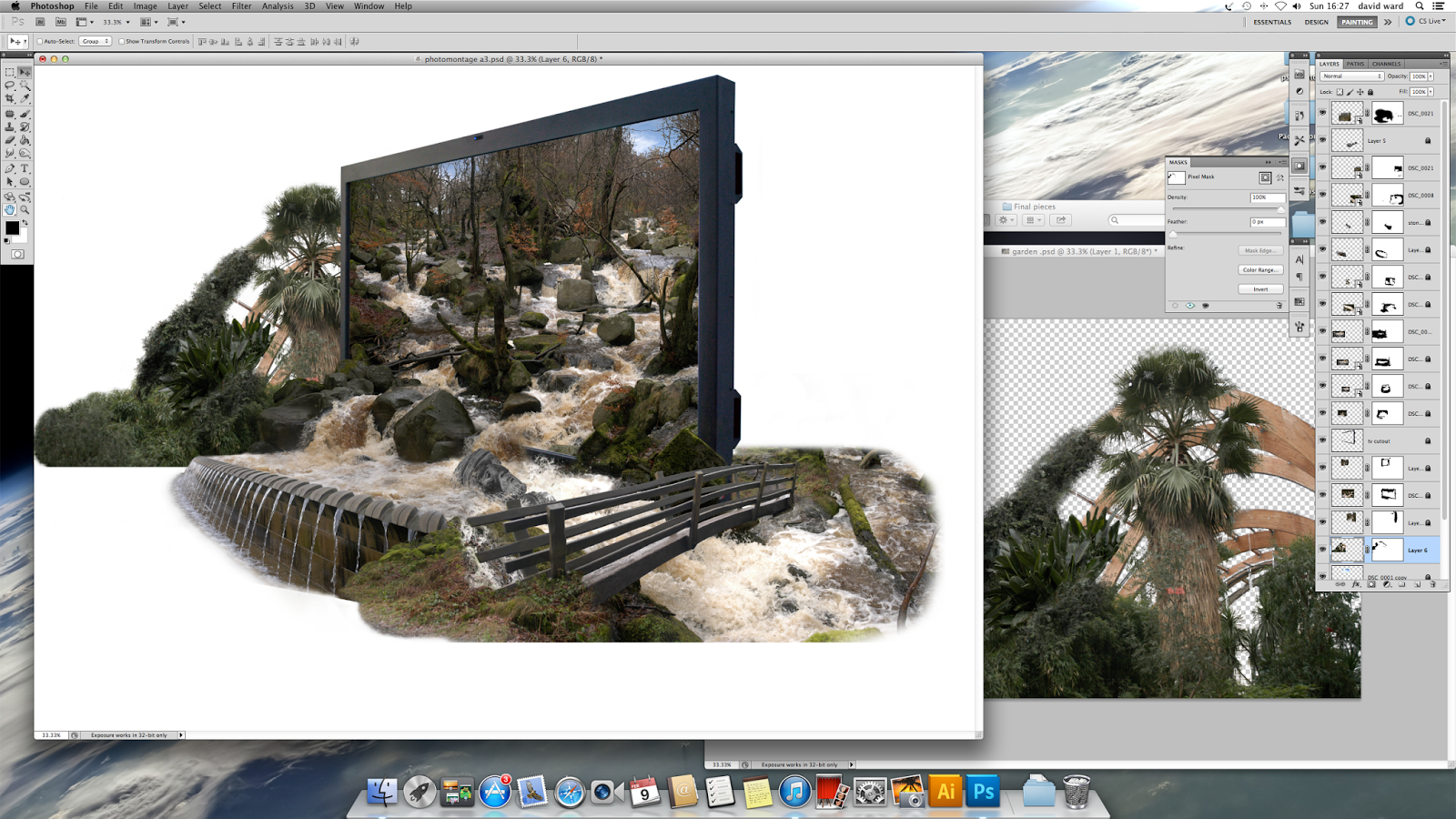
| This image was really hard to cut out. I just wanted the wooden beams and trees. I used a channel mask but this still didn't work properly (a valuable lesson to learn when actually taking the photography, think of how it can be manipulated in photoshop. |
 |
| After removing parts using a channel mask I used a foliage brush to paint or cut out the rest of the image. and added other parts of photos until I was satisfied. |
 |
| Then It was a case of small steps |
 |
| Slowly building the image up |
 |
| Blending |
 |
| And painting |
 |
| Until I was happy with the result Now I have the image the next step is the graphics, the message and the final composition. I have layered file saved so I have the freedom to play around with the image without the worry of not being able to go back. |
Thursday, 6 February 2014
Trial And Error
 |
| I felt that the I needed to do further experimentations before rushing to get it finished, So I started again. This time I used a setting known as HDR toning to try and enhance the images that I had taken. |
 |
| But I felt that the effect didn't work for what I had in mind, it made them look too bright and I found it hard to try to get the right effect, I felt less in control of the image. |
 |
| But I kept on going to see if I could make it work, So I started to cut out some foliage to see if it would help make the image better, for this I used the channel masking technique and painted out any excess pixels |
 |
| I placed the object in the image but yet I felt the image wasn't feeling natural so I left it there. |
 |
| Then I started to play around with other objects I had cut out to give myself a idea of how the composition would look . The hands do look ok but there is work to be done to make them feel as if they belong in the image as opposed to looking cut and paste, burning some shadows and dodging some highlights will help me with this. |
 |
| Then I had ago with a custom brush named storm cloud and painted in some cloud effects. With some care and attention this could work. |
 |
| Now I am starting to build this image towards a final out come. I started as I did before pasting photos, altering there perspective and blending them using layer masks. |

 |
| I yet again used channel masks to cut out complex parts of the image |
 |
| Blended them in within the screen |

 |
| Until I ended up with this. I am happy with this start, It looks natural the rivers flow the right way but and the perspective looks right in my opinion. I thought of placing more elements within the screen but I thought there was enough within the screen. |
 |
| Now I tried out a technique so I could control the light in the image.(this is something that would be done in the final stages as you have to flatten the image to achieve this effect). I flattened the image duplicated it, lowered the brightness on one layer and brightened it on the other, then I applied a layer mask which then gave me the freedom to pain light as I pleased. This will really help give the image some atmosphere. |
 |
| Now I started to think out of the box or out of the screen if you will. |
 |
| I started to place other images to see what fitted in with the image It was case of trail and error, flipping images horizontally, |
 |
| Blending them In |
 |
| Using the pen tool for more refined selections |
 |
 |
| Until I ended up with this, This is as far as I have saved up to, in other words I am happy with this. now I want to play around with the composition and effects to get a idea of how I can take this further |
 |
| This just seemed (the fountain) too out of place. |
 |
| Same with this it didn't seem natural and was hard to try and blend in. |
 |
| Now this is better I like how this part of the fountain fits, I can see how I can redirect the flow of the river and have a natural cut off point of the image |
 |
| This Image gives me the idea of where to go next and gives me confidence that this image will look good and not a total disaster. With more refinement and care I could do this project justice. |
Subscribe to:
Posts (Atom)