Thursday, 27 February 2014

Final Word

What a project, I learnt so much these last ten or so weeks I'm so glad that I pushed myself to do new things  because from now I feel that If I believe I shall acheive.

Digital Painting Process


First I split the character and chair and background into shapes on seperate layers one I had painted the shapes in a flat tone I locked the transparent pixels.

This gave mje the freedom to paint without going over the edges.

Then I started with the skin tone trying to distinguish the lights and darks of the tone.

Then I started to block in the mid tones of the clothing


The food and any other parts in a flat midtone colour

Then I started to work into the face to try and define the features

It was just a case of patience

I used one of my experiment images to help me build up the face

Then I started on the control pad and vest working into the canvas  trying to describe the form with light and shade

The pad proved to be really tricky


Next I started on the chair layer and started to work into that layer

For the fine details like the seam on the chair I used the pen tool to make some selections for aclean line

Then I just kept on going

Until I Finished
This was really hard to create and I am pleased with the result , my confidence has grown as the image has grown and I feel like I have done quite well.

Monday, 24 February 2014

Experimentation

This image was a experiment using the media known as brusho. Brusho is a ink pigment powder that produces vibrant colours when water is added. I decided to produce a very rough piece of graphic art based around the blackbird plane. the word is a another term for hidden and that was the black birds job to stay hidden away and spy on the other side.Lets face it the quality isn't there and the content doesn't scream out as great either but I could certainly develop the idea further. I could play on the meaning of the word stealth and hide it or blend it into the background. the colours in the illustration could be produced a lot better (something I know I am capable of).So the idea isn't bad but the execution is.  

The Formal Elements Of Design

Line
I have drawn this object using pen. First I described the shape of the object, then I have tried to describe the form of the stapler using cross hatching to variate the tonal values of the object.I love using ink and Is a medium that could fit well with a traditional graphic poster like the posters that I have been looking at. 

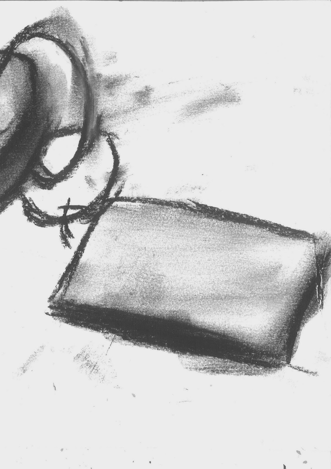
This experiment was a focus on light and shade in charcoal, although I have no control over this medium so it ended up as a poor result, I don't feel This medium has a place in this project I although I could produce some textural backgrounds scan them in and use them in photoshop.

Another line drawing but more focused on the shape of the object shape is where I start with any piece of work ,it's like the foundations of a building a good solid foundation leads to a good end result. 

On this image I decided to zoom further into a object an focus on the details I tried to describe the form using cross hatching and tone using pastels by smudging the pastels using my finger.

This object was created using just pastels, the effect works really well although I do prefer a more cleaner look to my drawings 

Another pen and pastel drawing focusing on the details of the object I used pen to create the line then pastel to create the tone , I added a white stripe of whit pastel to give the impression of the light hitting the object

Light and shade is very important I you wish to describe any object in as a three dimensional drawing. Although I have to bear in mind that time grows short and a 3D drawing takes more time to produce that looks good in quality.

This experiment was a nice reminder of the uses of traditional media. Digital media has been the main focus for the most of this course and probably will be through out but a combination of traditional and digital could open up so many new ways of producing many new styles.

Tuesday, 18 February 2014

Stop Communism Propaganda Poster

Stop Communism Artist Unknown Date Unknown
This piece of propaganda was produced in the west, the west perceived many smaller movements in the Philippines and other countries in the east to be allied with the soviet movement and this image certainly shows a narrow minded opinion, The west is simply saying that every one in that country and maybe the east is a enemy. this message comes across to me because of the soldier standing over all of the country with a blade in hand, the hammer and sickle describes the control the soviet union apparently has over the country and the colour red signifies danger to me, these are the design principles that have been used. Colour will most certainly play a important role in the images I will produce and I need to think what colour helps describe the message I maybe want to put across.  Yet again I am struggling to find out how these posters are made, but at a guess its was made for mass produce so I was probably a print plate that has been scribed or possibly a process similar to the aqua tint process that I looked at (Neil Woodall) 

Digital Painting (My Process)

My stage is to open the image and place it on the canvas, I put it at the top of the layers panel and set the blend mode to multiply, this allows me to see what I am painting and still see the line drawing.

Next I am blocking in the image with basic flat colours to begin with

Adding and changing until I feel It looks right.

Until the whole image is blocked in, from here I will slowly refine the image by adding variations if the tones to try to describe the forms until I feel ready to switch off the line art and render it up to the finished painting
At this stage the image doesn't fill me with confidence but there are no second chances here I just don't have the time so I will keep on going and see where it ends up.

Monday, 17 February 2014

The Opposing View

The playstation advert was my way of showing the good side of escapism now for the dark side. This is the final line art that I am going to use for the base of my painting. I wanted to create a character of a gamer addicted to games, a gamer that is forever glued to the screen, but I wanted to inject some humour into the image so I created this gamer chair that never takes you away from the action. I want this room to be dark so I have focused on the details in the foreground as I want the room to blend into darkness, the window is there so I can hopefully have some natural light creeping into the darkness to give that impression that the character is isolated away from the real world but it's always there. This image is a gamble I feel It could go wither way it could turn out good or atonal disaster, so lets find out.

Saturday, 15 February 2014

Artists Research

Same Year Different Weather
Artist, Date and Year Unknown
This is a USSR piece of propaganda from the cold war, firstly I find it interesting that there is a lot unknown or hidden(About the created or Date) from me, its just what the cold war was all about, secrecy. The images content is clever the artist has used bright colours and weather for the USSR side and dark cloudy dull colours and weather for USA, the characters add to this with the smiling healthy looking man on the right to the fat man on the right, even the items they are holding are symbols to go fore and against the two the American holding a wall street stock market paper possibly to try and describe america as  country inn financial ruin, and then the Russian man with the tool in hand to embrace there working class culture. I notice the the thermometer in the middle separates the two I see this as a symbol of the berlin wall that decided the world at the time, but from all this I see this picture as a lie Im sure the grass wasn't as green as the poster shows.
I like the style of the image though, it has cartoon feel to it and looks to have been hand painted, probably in a water based paint, it will have been a process of layering washes of pain up to describe the form of the figures. The clothing they are wearing has been chosen carefully to help show the stereotypical Russian and American. I like the idea of a divide between the two, both hidden away from each other, If i was to go down a where I was to have characters in it I would have to pay attention to the way I would dress them to reflect what side they belong in, but I cannot complicate this project as the time that I have doesn't give me that opportunity.

Niko

The Tenth Anniversary of the Victory of the Bay of Pigs
By Niko (1971)
Image found at www.creativereview.co.uk
This graphic poster was created for the tenth anniversary of the bay of pigs. It was the name of an invasion in cuba that ended in a massive defeat for the USA, this image shows a clear message of that defeat, the american flag burning and sinking into the sea although there wasn't any boats sunk at the time, I suppose america would have had that sinking feeling when this well planned operation back fired on them. The artist has made this image as simple as you can get, bold simple shapes of flat colour, I like the way he has used three colours for each separate part of the illustration, the two blues and white for the water, the three colours for the fire and smoke and the three for the flag and the most important part is the text that links the poster to the bay of pigs although I don't like the green and the way the artist has placed the pole (text) looks odd to me. I can't find the process that he has used but I believe it is a collage of cut out shapes or possibly a painting but the way the shapes are placed steer me towards collage. This is certainly a possible way forward, a bold simple approach that shows a strong message, something that I don't usually do, I have always try to put a lot into a image so maybe its time to take a step back?

Thursday, 13 February 2014

Colour Studies (Digital Painting)


This sketch is a rough idea of where this image is going . I have made notes of ideas that have come to mind as I sketch. I feel that the character needs to fill the frame more as he needs to be the main focus of the image.

I have started to block in the basic shapes of the composition in flat colours using a soft brush without pen presure (graphics tablet) I have kept the background and characters on seperate layers so if  anything goes wrong  I don't ruin the whole image.

I think that the colour choice looks too bright and cheery, I toned down the colours with a ajustment  layer to alter the brightness of the colours, this is where keeping certain elements on differnt layers will become important so that I can have more control of  the image. I want the image to have a blue tone as if the only light in this dimly lit room is coming from the tv screen, but this would comlicate the colur pallete as it is a area that is daunting to me so I wonder if a hue saturation layer would work ?

This could work but I doesn't give me a full idea ofd if it will be sucessful effect but the point is that in photoshop this can be added and removed easly. 

Final Adjustments

Now I was working towards the final image
I placed a photo cut out of my hands holding a control pad and painted  in the light using the same technique for the screen and blended them witha layer mask into the background.

Then I placed the image of the playstation three (that I cut out) and placed it in  the corner, from there I duplicated,  rotated and flipped it horizontaly then lowered the opacity to give the impression of a reflection. 

Next I added a gradient to the background using the gradient tool ot add a smooth change in colour and trying to make the playstation stand out, I also added some extra clouds using a custom brush to try to add futher intrest.  

I wanted to add some futher effects to try to lead the eye from the screen to the console. I created this effect by drawing a path using the pen tool, wich allowed me to stroke the path with the brush tool wich gave me a smooth painterly line.

I wanted to add some of the iconic playstation symbols (the button symbols on the pad) along the line.

To do this I created the shapes in illustrator then applyed the 3D  effect to them then draged them into photoshop.

From there I selected the sides of the shapes and applied a gradient for a shiny mirror effect.

And then I finaly added the lens flair effect for a bright sunshine in the corner of the screen.

Monday, 10 February 2014

Research into Artists

Work done by Roman Cieslewicz, Paris, 1968
Propaganda
Materials (unknown) guessing pen, ink and paint
This piece caught my attention because of its illustrative comic book look, but there is a serious message that is hidden beneath the surface. He shows the two superpowers of the world (USA,USSR) mirrored side by side as equal dominating powers, at the time when this graphical point of view was created, radical groups accused these superpowers of exercising a destructive influence on the rest of the world, betraying there own grass roots of there countries beginnings (american, russian revolutions). I can see how this opinion of the two came about. America and russia where constantly involved in wars throughout the cold war, never meeting in direct conflict but taking sides in other wars, Vietnam (south backed by USA, North backed by USSR), Cuba (The bay of pigs), Afghanistan. The design principles he would have taken firstly is what graphic message he was getting across, then it was a case of how he would do that, in this case he portrayed the two superpowers as a super hero (copy of superman) I notice that they are equal to symbolise that they were both as strong as one another, I also notice that each character is looking away from one another, I am not sure if there is a reason behind this because in my opinion they where both keeping a watchful eye on each other not looking the other way. His technique that he must have used is hand drawn in pencil then inked and finally painted in either acrylic or gouache paints, he has used a limited pallet,but the colours that he has used are bold and bright hues that where used in the old action comics of the day. A Interesting piece, I could create a graphic poster of my own and put my opinion of what I know about the cold war. I could even take It one step further and create a comic strip to show my own opinion but bring it up to date with digital technology, worth baring in mind.    

Sunday, 9 February 2014

One Step At A Time

Time to keep going.
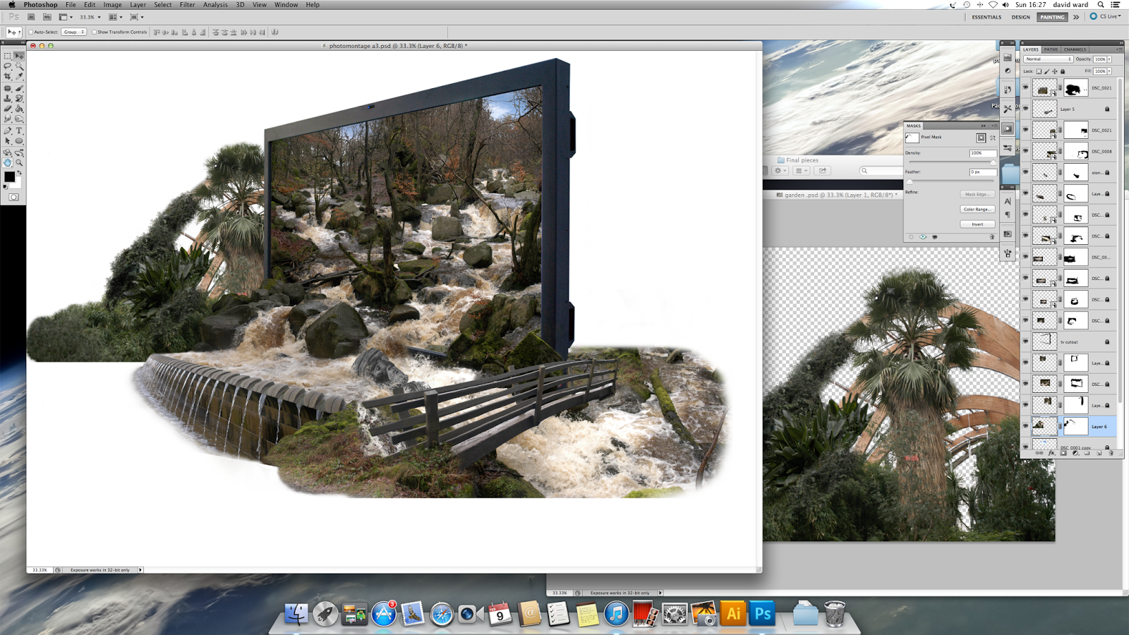
I started to piece parts of photos together, blending them until they looked right.

I wanted to add this statue but the colours didn't fit. so I desaturated the image which gave me a stone colour.

Then I submerged it in the river, I rotated and resized it.

Applied a layer mask and painted away parts using a custom brush that gave a splash effect to add realism of water rushing past the statue.

Then to end the river in a natural way I have tried to direct it around the back of the screen.

You could say I am over complicating this image but I am enjoying this process and learning a lot of how to use photoshop. So I cut out the bridge placed it and skewed and altered the perspective until it looked right.

Then one step at a time blended parts of photos building it up slowly.

This image was really hard to cut out. I just wanted the wooden beams and trees. I used a channel mask but this still didn't work properly (a valuable lesson to learn when actually taking the photography, think of how it can be manipulated in photoshop.  

After removing parts using a channel mask I used a foliage brush to paint or cut out the rest of the image. and added other parts of photos until I was satisfied.

Then It was a case of small steps

Slowly building the image up 

Blending 

And painting

Until I was happy with the result
Now I have the image the next step is the graphics, the message and the final composition. I have layered file saved so I have the freedom to play around with the image without the worry of not being able to go back.