Sunday, 9 November 2014

"Alton Towers Fireworks"

This weeks cultural event in this case is all about the Alton Towers firework extravaganza. It's just simply and amazing spectacle of timing and well coordinated planning to put together this emotional spectacle. 

I say emotional because they manage to tell a story through music voice overs and fireworks, the only word to describe it s epic. It's the only place that I have ever been where a crowed filled place that falls in to silence which is because of their amazement of the show.

When you leave, all you can hear is conversations about the fireworks which proves that Alton Towers are becoming just as famous for the Fireworks as well as their rides.


Saturday, 8 November 2014

Telling A Story On A Box Brief & Research


Brief

London 1887, in an alternate time line where the industrial revolution kept growing and growing, a time where steam power was the only source of power for the future in the eyes of inventors. As a result London was city of steam, a city where blimps roamed the skies, and a city where steam power was part of the Victorian culture.

Within this backdrop, newly promoted Detective Jacob Strider is working these dark, mist filled streets of this Alternate London where fraudsters, thieves and murderers lurk around every corner.

Reference Images
Images Sourced from Google images

The images below have been selected to draw in details such as clothing and hairstyles, right through to  the landscapes and architecture.

The first two are images from the popular television series "Ripper Street". I have chosen the show because of it's time period and setting which is around the 1880's. I was looking at the style of clothing that a Detective would typically wear around that time and the facial hair styles as well.


Steam Punk
Images Sourced from Google images

In the short brief I wrote, I was describing about a alternate style London. A London where the industrial revolution never stopped evolving in steam power. This was a nod to the art style known as Steam Punk. I wanted this to be cross between a Victorian Detective with a touch of steam punk madness, so I sourced some images off Google to see what wacky inventions people added to their clothing.


Steam Punk
Images Sourced from Google images

For the background of the game art work, I wanted to focus on a smog or steam filled heavily industrial London, so yet again I sourced some old images London within this time period for reference.


Steam Punk
Images Sourced from Google images

To add further details in to the image and to remind the viewer how this fictitious London isn't the same, I found some images of how fart people will take the word "Steam Punk" Theses images are perfect to add further interest to the image. You could also bring in a vehicle as a sort of a character that's apart of the protagonist, like the Bat mobile is to Batman.


Typography
Images Sourced from Google images & www.anewhype.com

I clearly would need a title for my experimental front cover, so I looked up a couple of images from the two styles I was looking for. The two styles clearly show so many similarities that I'm sure that the Victorian era lends parts of it's fashions and styles to Steam Punk. The fonts have distinct imperfection because they where most definitely hand drawn plates for press. I notice how that are all uppercase lettering with sans serifs on the ends. I like the scrolling patterns around them as well but I don't see how that could work for a gritty detective theme. The overall point was to observe and put this into practise with out getting carried away with it.


Wednesday, 5 November 2014

Telling A Story On A Box

Following on from my last post, I thought it would be best to set up an experiment for the tomorrow day, so I come into college prepared and focused. I'm going to set my self a challenge, to create a simple but effective game package front cover with a short brief, a few type faces to create my own and a set of reference photos to draw from.

I'm doing this to get my drawing skills up to speed again and to see if I can tell a successful simple message, just from the front cover.

However, before that I thought it would be a good to take a look at a hand full of images that aren't beyond the bounds of the technology that I have (Photoshop & Illustrator) and see what knowledge I can gain from them.

Red Dead Redemption by Rockstar Games

It's as clear as crystal that this is a western game. Everything about art work form the horses in the right hand corner to the style of cloths the main protagonist is wearing, all point towards this theme. The font has a distinct western look to it with a rough eroded look although I am surprised that the font hasn't got sans serifs to it like you see on a old wanted poster. The stars and stripes pattern makes this clear that this is tale that takes place in the American west. You also get that this a story of redemption because of obvious reasons.

It's something that I over look when I buy a game but it's interesting when you stop and take a look at a games package and realise how much of a story you can read from just a front cover.


Alan Wake by Remedy

This is a perfect example of how this game show it's atmospheric mood and setting on the cover. Alan Wake is a scary edge of your seat type of game which is set within a rural lake side town. The art work shows this off quite well in a simple yet very effective approach. The dark colour pallet shows this is dark game the, the forest and the type of mist you would see settle on a lake spells out the setting and finally the torch in the characters hand show an important role in the game which is to "fight with light"


Grand Theft Auto V by Rockstar Games

Grand Theft Auto game front covers have always been fun, vibrant and great for showing what type thing you can expect when you play it. This most recent entry is themed around money which is why the "V" is in the style of a dollar theme. As for the rest of the package, there are nods to all the many different types of activities you will get up to, the characters you will meet and weapons you will shoot.

Thinking back to some of the older versions of this game, I can remember how they are also themed around the era that the game was set. GTA Vice city was set within the 80's and the box art reflected that vibe with a neon type face and even more bold an bright colours and characters with a distinct 80's flavour fashion to them.


Sleeping Dogs by United Front Games

Finally, my last image is from a game about a undercover detective, infiltrating a triad underworld. Yet again the designers make it clear that this is game with a Asian influence. You get that immediately from the character ethnic straight away but, you also get it from the Chinese art work, martial arts and the city which reminds me of Hong Kong back drop.


A great bit of research and one that has given me a better understanding of what type of things I would need to include within this experiment. My next step is to write a short brief in my sketch book, make a list of things to include that I have learnt from theses images and from that gather a few drawing references to help me along.

Beer Mat Design Experiment "Laser Cutter Video"

To cut out the stencil for the beer mat design, I used the laser cutter. First I designed the image on illustrator making sure the paths were set to 0.01, then placed into coral draw so I cut cut it out with precision. I used a quick setting with about 50% in strength to avoid the stencil burning.
Click the link to view the video

So We Are On The Same Page

I feel like I have come to point where I need to explain where I am at in both my sketch book and blog. I'm doing this because I found that my research has been a little disjointed from my sketch book. 

To try and keep things in a logical order, I have created a brief to explain what I am doing and check list of tasks for me to get their so I keep focused on the project. 

I will keep on researching on my blog along with the visual research needed to make this presentation come together.

Project Brief

Fusion ( or another name) is an event, an event and celebration of all types of cuisines from the Asian continent, brought together in one place. My aims for this project and presentation is to plan, design and brand this event as a whole, to build it up into one coherent celebration for businesses to sample their products and dishes out to the general public. 

To present this , i will need to plan this down to the fine details, from the place from where it will be held, the time of year, who it's aimed at, right down to the brand logo. Another important aspect is how it would be marketed, I would need to know how I would be marketing it leading up to the event and during. Prices are another important factor, i would need to know what the purpose is a such as profit or charity? All this research and information will need to presented in a professional manner, so I will present this in a visual and oral form, possibly in a video or power point backed up with oral notes. I also want to have actual information presented in a professional manner so the listeners are interacting in some way or form, maybe a leaflet, or event map of some kind?

Time is always the real issue, so planning will be needed, I will have to weigh up what the most important pieces of information need to be in the presentation. If It's the difference between an event map or a definite place where it will be held then  I would have to go with the latter.

This a daunting task but one that I'm willing to try, It will put my organisational skills to the test and give me an insight of the marketing side of design.

Project Check List 


The Joker "Halloween Costume"

As it is Halloween this week, my mind has been set on finding myself a costume for a party. I searched through so many different types of costumes and eventually decided on this infamous comic book character "The Joker"

The costume was created by a company called Rubies who have been specialising in fancy dress for over six decades. They hold numerous licenses for a vast range of characters from films, comics and games. 

I find it interesting how you can buy the rights to an interpretation of a particular character for instance, this version of the joker is one of four that I know of. This one in is probably the closest to the original comic book character in my opinion.

I can't give you a definite explanation as to how it was made but I could take a close guess. The product was made in china most probably in a massive factory. The quality seems about right for the asking price but I will say that the image below shows it at it's best. 

One thing that I have realised is that there it's hard to be original. Every idea that I came up with had bee done by the companies which shows they are constantly moving forward as a business.

The costume was made by a company known as  Rubie's
www.rubies.com

A Mix Of Asian Art

In this post I have been looking at various different styles of Asian art to see what can be learnt from them in both style and techniques.

Migy

The first of out of this collection of research is from an artist that I can only name as "Migy". This piece was designed for Ajinomoto which is a massive food corporation which was founded over 100 years ago. I love the simplicity of the art work and colour pallet. The illustrations have a distinct hand marked style to them which reminds me of the way many Asian calligraphy styles are like, (meaning they have a hand drawn imperfection look to them. Its a style which I find difficult to master because with my illustrations, I try to keep full control over the media, instead of the media controlling the style ( if that makes sense).

This idea of a mixture of illustrations could work perfectly for my event, I could try to create many different illustrations of the many cultures that Asia has and bring them together in one place (or one illustration) which communicates the exact message that the event is about. The style could also work for an event map as well!


Another aspect to draw from this work is a potential sponsor that could be well suited for my event (Ajinomoto)which would be part of the people I would pitch this idea to.

Indonesian Art

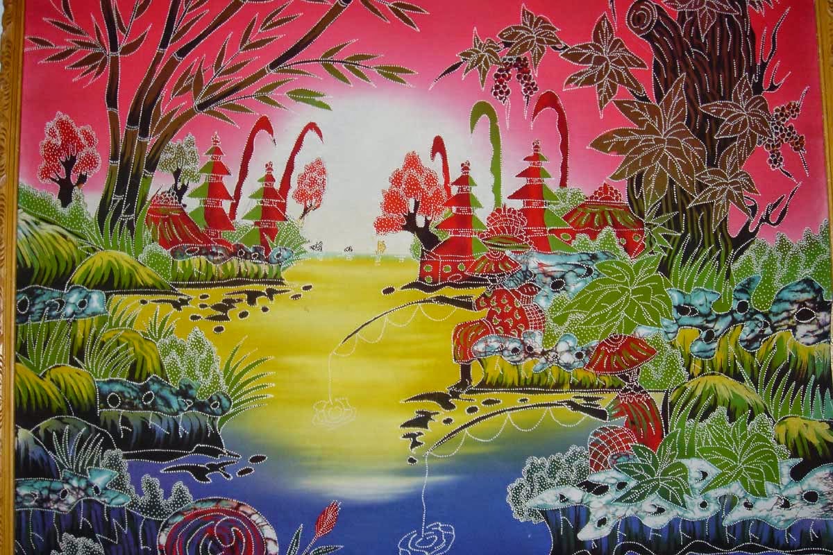
These next pieces of art are from Indonesian origin. The term "am batik" was found which translates into "cloth with tiny dots'. The images are made up using lines of dots an coloured with colourful dyes.

As a style, I find them to complicating for a way forward (not to mention a time consuming) but I see how they share a similar resemblance to some of the Indian paintings that I sketched out in my book. They seem to share a distinct 2D look to them and when I think about it, you can find this look within Japanese woodblock prints as well.

What's clear to me that whatever style I choose for my event, needs to be simple and a focus of a two dimensional look but I still won't rule out more original approaches.


Katsushika Hokusai
Plum Blossom & The Moon
www.katsushikahokusai.org

Hokusai is a well known artist who created many famous paintings an print works in his day. This particular piece caught my attention for yet again it's simplicity. It seems to becoming a common style theme in this project, a two dimensional approach however, I like how there is a kind of three dimensional look to the moon, it almost looks like a combination of the two (2D/3D).

This takes me back to Ekios New york piece which I love. It's this combination of 2D and 3D that interests me the most, it's also giving me ideas for a simple video.