Wednesday, 18 February 2015

A Very Different Direction


Taking on the advice given to me and the reaction from my group when I showed my drawn animation, I decided to look a little further in to various ways I could communicate a story.

Hattie Newman

I have grown fond of Hattie's work and managed to find yet another reason to love it more. The following video was developed for the Child Line organisation which communicates a very serious message in a fun, inventive way which appeals to the key audience that they are reaching out to.

It's so clever how she's used so many processes in one piece that works successfully. Breaking it down, I can see how Hattie has used a combination of illustration, paper craft, graphics and film making. Then there's the work from the behind the scenes such as the writing, the making and the story boarding.


The Flippist
Here is another example of which I was pointed towards, the flip book is one that I have thought of but have over looked for it's potential. The Flippist is a a company that specialise in producing a flip book animation that are tailored towards you. They produce everything from corporate messages, to proposals and birthday messages. 


What a great way new way for experimentation within my sketch book and blog,  I could combine all the various processes towards one message. This is worth trying out tomorrow in college, I need to write a short story using a random theme and produce some samples to gain a understanding if could work!

Friday, 13 February 2015

Group Work & Next Steps

I liked presenting my work in the lessons because it's system which keeps you on your toes throughout the unit. We sat down as group and showed what we've done so far which led to positive feed back and  potential ideas to go with next. 

I was quite surprised with the response, a few people thought I was doing more of the same and believed I had an idea set in stone. I tend to agree that i was swaying towards this idea of tourism and promotion using narrative but nothing was set in stone. 

I was really surprised with the response from my video drawing, my fellow students wanted to see more of this and I believe this could well be an interesting direction to try out. 

I have been advised to focus on several key areas which are, illustration, video and to try out idea that are more serious. Yet again I agree, my work does seem to be on a more positive subject, maybe I should try out something that could have more of an emotional impact?


The Future

A £400 million pound leisure, health, sport and eduction destination that's right on our door steps that will provide 1300 job opportunities. This prospect excite me and is going to be a massive part of our future and local culture whether it's for the better or for the worst.

The reason I have brought this up in my project is because there could be potentially vast amounts ideas and ways to include this idea of a regeneration project in my work. Imagine if I was to take this idea and sell it with a brand. There could be a corporate identity, advertisement, tourist maps and events. I could create a film/television commercial using my new editing skills, the list could go on but my group has argued that this is more of the same if what I have done before and I tend to agree but I won't rule it out yet.


Information and images sourced from: www.chesterfield.co.uk/developments/peak-resort

Book Research Continued

In this piece of research, I have been looking at various other ways to interpret or include a book. The first out of these is another press advertisement from McDonalds. This image was used as an advertisement promoting reading for young children. They replaced the normal toy with a small children's book.

This is another potential route, I could promote a book within a much bigger idea. This could give me the opportunity go down the packaging route again but I must say will I be really pushing my boundaries?

This is one of my favourite pieces that I have discovered yet on this project. I love how they have used raw materials that all relate to the subject matter, from pizza box background and the vegetables intricately placed to form a jungle, through to the illustrated world which looks like it's been painted with grease!

What's best is the message which is all about how we are quickly tearing down the rain-forests which ties in with the recycle theme. A brilliant piece.


Wednesday, 11 February 2015

Hattie Newman

Hattie Newman is a illustrator and animator whose work is just bursting with style and personality. She uses paper as medium, heavily in her work as a way to communicate a message. These book illustrations were created on a very large scale so she could place real world objects to bring the book to life before photographing them ready to go into publishing. 

Working on a large scale is a process that excites but, in the same time intimidates. I like this idea of mixing real world objects with hand crafted ones which could give a potential experiment a unique style and look. I shouldn't rule this idea out because I do have a photography studio available at college. 


Paper illustrations by Hattie Newman for French GQ Magazine.
www.hattienewman.co.uk

A Book Can Change The Story Of Your Life

Continuing and expanding on my book research, I found another illustrative approach to another press advertisement. This selection is adverts where commissioned by Puffin Books and illustrates how a point in your life can change by the means of a book.

I can totally relate to this because books have changed my life through education, they inspire and ultimately better yourself. Looking back, I can see that my life could have gone off the rails but, education changed me.

looking at it from a design point of view, I love the simplicity of the drawings and how they have used colour to paint a very different path when it travels down the wrong route. The drawing has been drawn by using an isometric grid which acts as a ground which is a process that I'm quite familiar with, I like how they have used this to their advantage with the diction changing book siting along it quite nicely. 

The use of narrative is becoming more important the more I look at these kinds of works and I'm sure it's going to play a key role in  this project.


Agency: Y&R, Beijing, China
Creative directors: Nils Andersson, Ronnie Wu, Donghai Liu
Creative team: Candy Wang, Ronnie Wu, Jianjun Geng, Nils Andersson, Gao Han, Donghai Liu

Monday, 9 February 2015

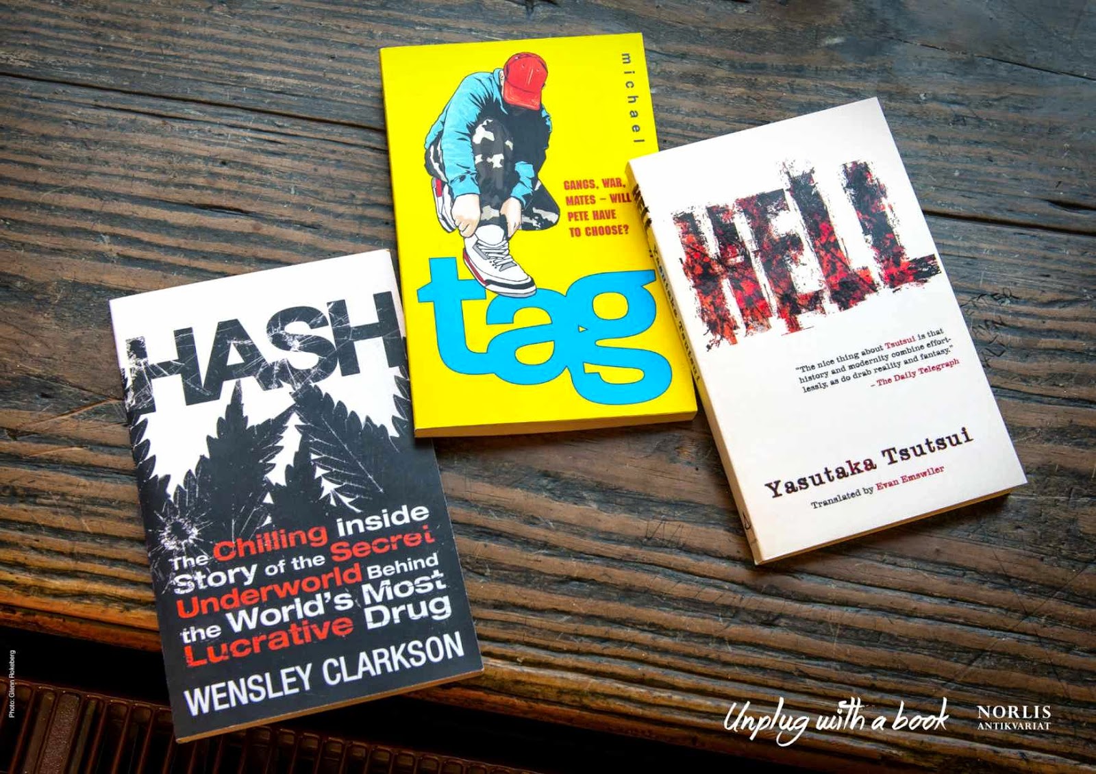
Unplug With A Book

These selection of adverts for books shows how simplicity can really have an impact. I like the way the design team have chosen each book carefully with a visual to back up each word. I wonder if you took away the text, you could read it as easily?

The composition works really well, this is down to the non uniformed look and the choice of odd number of words they have used. I can't imagine this working as well if you used and even number of words.

The common message in the corner of each image is a clever nod to the over use of the various social media's that dominate our culture these days. Unplug with a book seems like a sort of promotional campaign to get more of the younger generation to get into more reading.

Yet again, this could be well worth a try, to see how effective it can be achieved, I wonder if I could also communicate a message with out the words using just visuals in stead or even two messages combined?


Agency: Anti, Oslo, Norway
Creative team: Jason Kinsella, Erik Heisholt.

Wednesday, 4 February 2015

Sharpie, One Story Two Points

These set of images are perfect examples of supporting my opinion of advertisements being a reputable interpretation of a book. The adverts were commissioned for face book to advertise the well known brand "Sharpie".

It's very clever how they have linked the double pointed pen with the idea of there being two sides to every story by illustrating each side of the advert the different weights at each end. One is more simple and one is more detailed but this goes beyond the actual aesthetics, if you look a little deeper you will notice how the detailed drawing, is a more detailed narrative aw well as opposed to the more brief and simpler drawn one. 

I like the contrast between the flat looking illustration and the photographed pen, it really makes the product which is the main focus stand out of a otherwise busy piece. 


This could lead to some interesting experiments but the question is, how could I promote something of my own using a similar process?

Advertising Agency: Draft FaqCB, Sao Paulo, Brazil
Creative Directors: Joanna Monteiero, Max Geraldo
Client: Sharpie

Tuesday, 3 February 2015

Seitenbacher Musli Cereal

This work of illustration caught my attention because I saw an instant connection with a ancient column in Rome called Trojans Column, which is situated in the Forum Romanum of Rome.

The Column is covered in images that spiral around, depicting scenes from the emperor's victorious Dacian campaigns. It's this visual idea, which I see as a link to the Muesli Advert. You can see how the illustrator has used a similar, spiralling method showing a busy day ending with a good nights sleep which naturally leads to the message "No Wonder You Always Wake Up Hungry"

Judging it for it's visual attributes, I love the overall design. The spiralling illustration catches your eye, which then leads your eye around the visual narrative eventually leading you to the product. As for how its was created, I couldn't say. I would guess it was created using some 3D software or even photoshop or the figures could have even been made out of a modelling clay. 

This is further proof that advertisements can be interpreted as books, I would just have make sure that there is a strong narrative within my work, making sure it's clear to the viewer if I choose to go down this route. 

Images and information sourced from: www.creativebloq.com
Illustration by Monty Aji Hardito
JWT Jakarta Advertising agency

Sunday, 1 February 2015

Television Adverts

This idea of an television advert being an interpretation of a book raised questions in discussion, but I stand by word believing that some adverts use narratives to sell their products which is the key similarity that I find they share with books.

Alton Towers Adverts

Alton towers adverts are a prime example of this, they use a narrative which ties in to the theme of the new attractions that they are advertising.

The first and most recent video uses a fantasy theme which ties in to the new enchanted village. The producers manage to capture the essence of the theme and tell a story of a families arrival, it's almost watching a part of a fantasy film. 

This is the clever part because by using a narrative which has been injected with high quality effects to sell the dream, they are basically showing that this could be you and your family this summer, which will most certainly capture the imaginations of children, who will then go onto bug their parents to go.


The same goes for this advert which was about the ride thirteen which took inspiration from horror films which remind me of the film "The Ring" and was showed as a post watershed viewing because of the content. This would instantly appeal to a teenage audience who are the type of age group that would be more likely to visit.


As I said, I believe it's the narrative that links it to this idea of an advert being an interpretation of a book. So why am I looking at this sort of research? Well film making is something that I do a lot at work but I have never really tried to create an advert using my own concept. From experience, I believe it shares a lot in common with your typical graphics design or illustration. It's all about communicating a message. This could be a way of supporting a product I might make or advertise, it could be a story, the possibilities are endless.